
The Design Studio
A peek inside my sketchbook, filled with pin badge ideas and raw designs
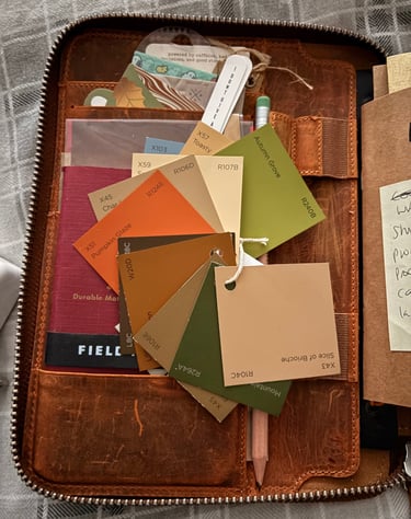
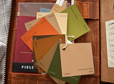
Inside my Design Folio
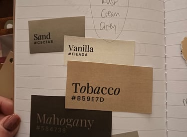
I've always like neutral colours, and I wanted Weeze & Co to have a very cozy feel. I wanted natural colours of creams, browns and greens, and I went to my local DIY store to grab some paint chip cards in colours that grabbed my attention.
I really liked these colours and I really liked some of the names, and combined they now form the basis of all Weeze & Co branding.
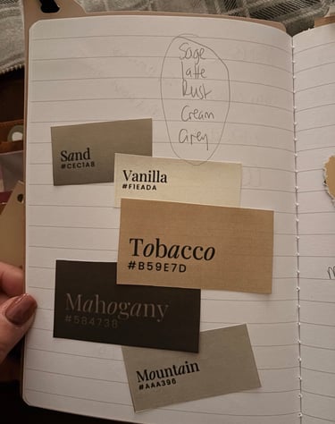
The Colour Palette
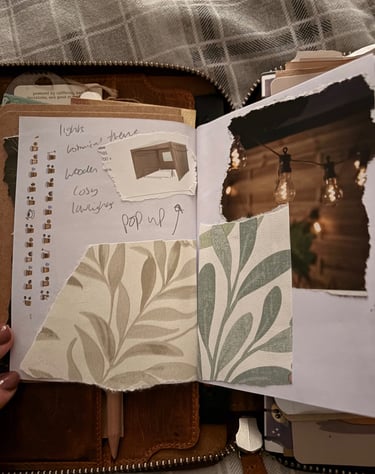
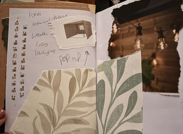
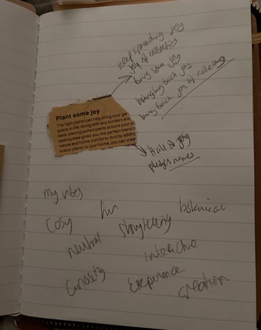
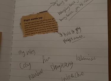
I collected bits from magazine's that had the vibe I thought Weeze & Co would have. I envisioned a cozy pop-up with warm lighting and a botanical feel.
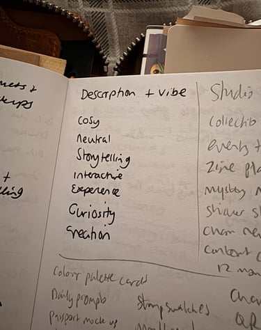
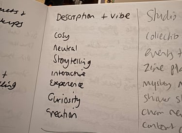
I wrote key words that I wanted to ensure Weeze & Co lived by: Cozy, Neutral, Storytelling, Interactive, Experience, Curiosity, Creation.
The Vibe
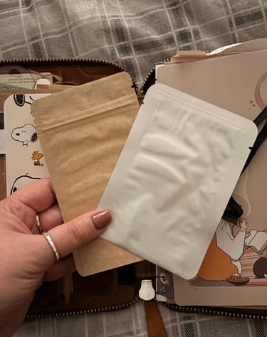
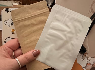
I collected samples of blind bags to use, I didn't know if I wanted to be using Kraft bags, or white, all I knew was that they couldn't have a window as I knew I wanted them to be blind bags.
I eventually settled on black for the bling bags.
Packaging
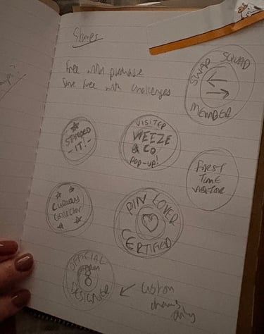
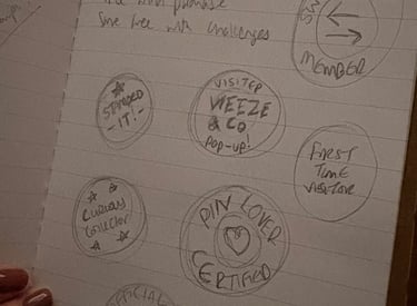
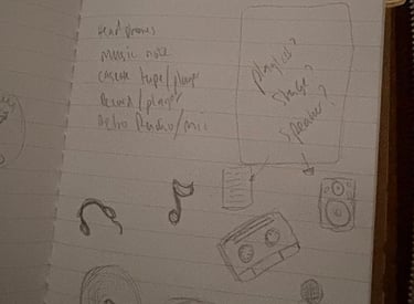
I knew I wanted to do collectible stamps for Weeze & Co. I love the idea of collecting stamps from events, and I wanted to create a collectible feel. All stamps I wanted to be available at certain times or certain events to create a fun interactive experience.
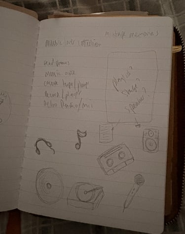
One of my first ideas was a music theme, but the more I sketched the more I thought it would be too niche, and not everybody enjoys or listened to music.
These designs did not make it into pin badges, but those of you that have our sticker album, you will notice these designs are included in there as stickers to collect.
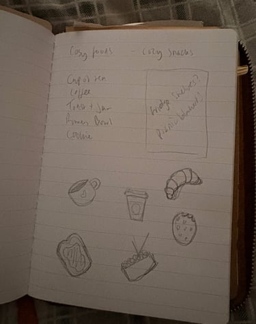
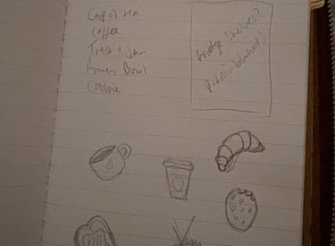
One of my first OG ranges, the cozy cafe range. I really love these designs, and I think a cafe and journalling always go hand in hand, even if you don't drink coffee.
This range had been adapted in design before they were sent over to the pin badge manufacturer but the original theme still shines through.